Photo-a-Day (Wednesday, 16th September, 2015)
Stubshaw Cross
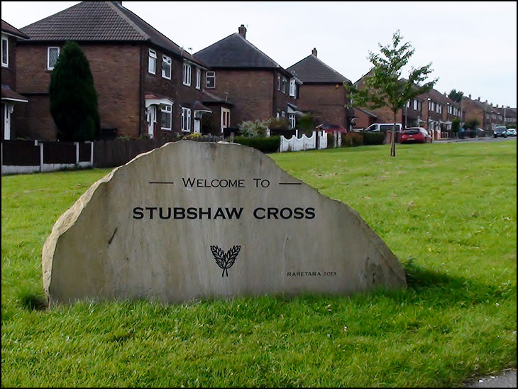
Photo: Mick Byrne (Sony HDR)
Good clear sign, much better than the Scholes stones.
agree aubrey far better than the scholes one .approaching that you wonder what the hell is it ,its only when your near and i mean near does it become clear .very poor
Moan, moan, moan. Mick do you do anything else but moan, your worse than jarvo.
Christine the Scholes one was designed by school children, thats why the letters are the funny shape that they are.
lectriclegs. Where is the post where Mick has moaned? Seems you need new specs!
That's a great photo Mick.
Who's wound lectriclegs up? Mick's said nowt.
The Scholes sign is a missed opportunity. It is wasted in its present position - as christine says, it is far from clear from most angles what it is. This is partly because it is up on an embankment, with the terraced housing behind giving a broken background to already jagged stone letters. Also, it is parallel with the road, and you only get a clear view of it from the pavement opposite.
To my mind it resembles 3-D graffiti lettering, and should have been placed at ground level against a plain background, and where it would have been seen plainly from a distance. Perhaps at a 45 to 60 degree angle to the road - but facing up the hill, so you'd see it at its best from the Balcarres pub on the other side of the junction.
I also think the graffiti idea should have been built on, too - with the school kids being invited to depict their idea of Scholes in paint on its surfaces. I expect their work would soon have been replaced by others' graffiti - maybe even our own Banksy.
There are a lot of signs in Wigan that School children have designed that are very good. I am sure the word Scholes done by the children could have been incorporated into something better than it has. It is difficult to read and stuck on the top of that hill looks like something out of the Flintstones. The above sign does the job very well.
The style of lettering used, reminds me of a typeface called Spartan. I used this a lot at Wigan Printing Co. in the sixties. Most of it was used for handsetting business cards and/or letterheads. It was horrible to distribute back into the 'case' Happy days though